Form
Form Choice
The Form Choice Steptype is used to make a choice between a various amount of options. These can be displayed with radio buttons or within a select box. In addition to the choices, more information can be displayed beforehand and after the input. By submitting the form, the chosen option will be saved in a variable whose context and name can be specified.
Configuration Possibilities
The available options have to be configured within the Field Options in the Form tab. The format of the possible choices is variableValue: displayedText. Therefore the value before the colon declares the value, that will be saved as the answer and the text after the colon is shown to the participants.
CAUTION: The next option is determined by a line break! Do not insert more than one option into the same line!

In addition it is possible to have one of the defined options selected as a default value already. To accomplish this, the value of the chosen option needs to be placed in the Field Default Value field.
View

Form Choice Multi
The Form Choice Multi Steptype is similar to the standard Form Choice Steptype. The difference is, that more than one option can be chosen. Therefore the options are displayed with checkboxes by default and can be displayed as radio buttons as well.
Configuration Possibilities
The available options have to be configured within the Field Options in the Form tab. The format of the possible choices is variableValue: displayedText. Therefore the value before the colon declares the value, that will be saved as the answer and the text after the colon is shown to the participants.
CAUTION: The next option is determined by a line break! Do not insert more than one option into the same line!

Furthermore Field Default Values can be selected as well, as shown in the previous picture. These are the options, that are selected already, when the participant did not select anything yet.
View

Form Config
The Form Config Steptype is a configurable form for multiple input fields. Therefore this Steptype qualifies for customizable questionnaires, including validation possibilites as it is based on a Zend_Form configuration format.
Configuration Possibilities
By default the Form Tab already contains a various amount of possible questions and input possibilities for a post experimental questionnaire. As stated in the Processing Tab of this Steptype and as shown in the screenshot below, the variable names are defined by the first part of each configured form element. The context will be the same for all variables and it will be defined in the Processing Tab, as it is in all Steptypes.
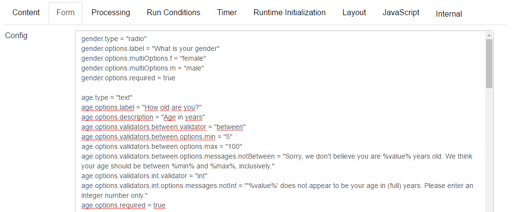
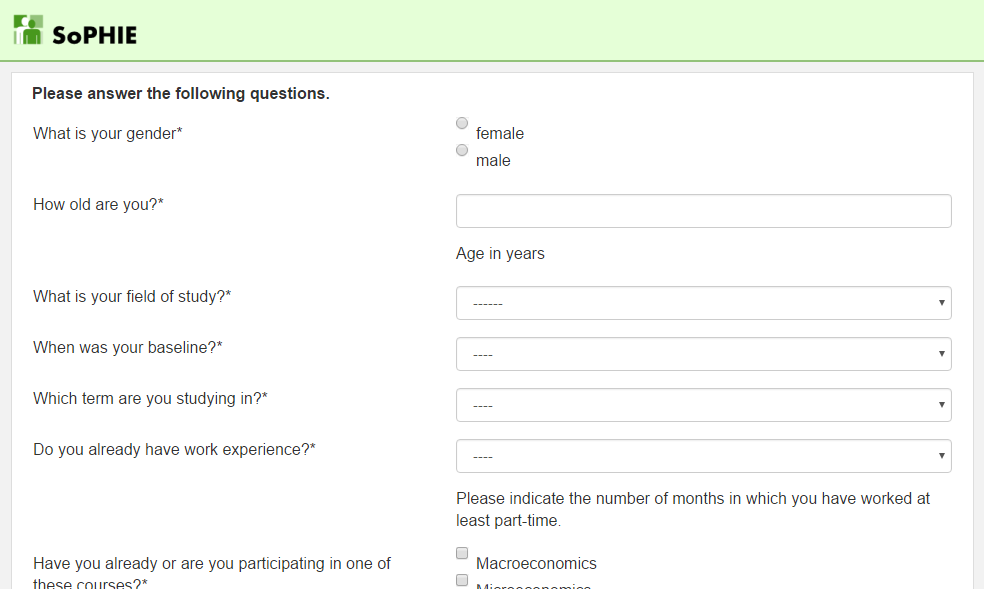
By comparing the displayed configuration to the view below, it becomes clear, that the description adds an information field below the related input. Adding the required = true attribut to a form element forces the participant to make an input for this element. This is displayed by an asterisk in the view. Possible answers can be predefined for various form types and are signaled by multiOptions.
Note: This Form, including the validators is based on the Zend Framework.
View
Form Input Number
The Form Input Number Steptype allows the participants to make number inputs with several possible limitations for the input. The entered value will be saved and can be accessed throughout the experiment.
Configuration Possibilities
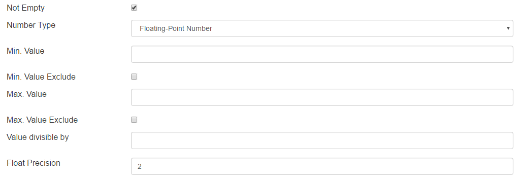
At first it is possible to decide, whether the input field can be empty or not. By default an input has to be made and the checkbox for Not Empty is checked. Besides that it can be distinguished between integer or floating-point numbers. In that regard the Float Precision can be specified for floating-point numbers.
Furthermore the minimum and maximum value for the input can be defined. As well as that, it is possible to decide, whether these defined values will be excluded of the range or not.
The Steptype then takes care, that no other inputs can be made, especially no inputs that might try to access the database.
In addition the experimenter can decide, whether the text input field is automatically selected for the participant, by selecting the Autofocus checkbox in the Form Tab. If this parameter is not selected, the participant has to select the input field actively
View

Form Input Text
The Form Input Text Steptype allows the participant to enter a String of a defined length and form. This can be used for email inputs, including the syntax validation, the input of a student ID or a name.
Configuration Possibilities
In the Processing Tab of this Steptype, the Valid Values for the input can be defined. There are various options from an acception of any input, digits only, alphabet including whitespace or valid email adresses.
In addition the experimenter is able to decide whether the participant has to enter a valid input, by selecting the Not Empty checkbox. The Trim Whitespace functionality removes any whitespace at the beginning and end of the entered input, which may be helpful when the inputs will be checked for equality. Furthermore the expected length (Min. Length and Max. Length) of the input can be defined and the length of the input can be shown to the participant.
If the default validation and limitation mechanisms are not sufficient for the needs of the experimenter, an individual Validate Script or a Regular Expression can be used as well.
View

Form Input Textarea
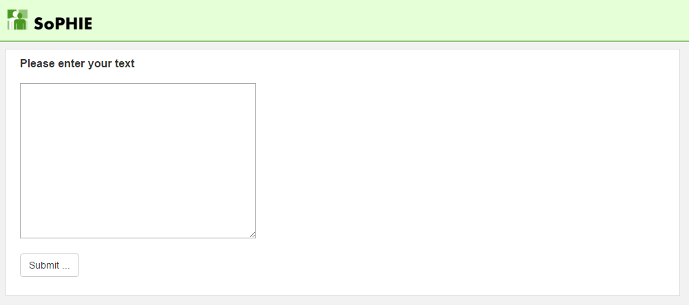
The Form Input Text Area Steptype is an extension of the Form Input Text. The Configuration Possibilites will be exactly the same here. The only difference is the extension from a single line input to a textarea of variable size. Within the Form Tab the Textarea Rows and Textarea Cols can be defined.
As noticeable in the bottom right corner of the textarea in the screenshot below, these parameters are only the starting value and the textarea can be resized by the participant. The textarea can not be drawn smaller than the inital values though.
View
Form Fileupload
The Form Fileupload Steptype expects the participant to upload a file. The uploaded file will be saved and can be accessed throughout the experiment.
Configuration Possibilities
This Steptype allows the experimenter to set a Max File Size (kB) as well as the MimeType for the uploaded file. The most important configuration for this Steptype is the way of saving for the file and is already described inside the software as it is in the following.
When using the File API as Storage Type the content will be saved outside of the database. The Variable Name will contain the file path to retrieve the file using the File API later on. When using the Variable API the file contents will be saved as a base64 encoded string directly into the database. The Variable Api can only save small files and has other technical limitations. Using the File API is highly recomended.
View

Form Scale
The Form Scale Steptype can be used to rate an experience, evaluate an experiment or evaluate a class performance. It displays a scale consisting of radio buttons that can be labeled.
Configuration Possibilities
Depending on whether the participants should be influenced from the start, it is possible to set a Field Default Value that has to be in the range between Scal From and Scale To, which define the upper and lower bound of the scale. Furthermore the Scale Stepsize can be defined here. By doing that only the numbers 1 and 1 plus a multiple of the Stepsize will be displayed. Through the Number Legend parameter, the experimenter can decide, whether the numbers should be displayed for each radio button or not.
If the Number Legend is set to Do not show, a customizable Scale Caption can be entered below the scale. The caption on the Side can be displayed with the Number Legend as well. The caption can be defined in the text fields of Scale Caption Left, Scale Caption Center and Scale Caption Right. The Scale Caption Center will not be displayed, when the Scale Caption will be displayed on the Sides.
Depending on the use case it might be helpful to have a wider scale with a little more space, especially when there is a customized caption below. Therefore the Scale Width (CSS) can be defined here in pixels. An example here would be 500px as an entry. In addition information can be displayed above or below the scale by using the Content Before Form and Content After Form.
View

Form Scale Multi
The Form Scale Multi Steptype is an extension to the Form Scale Steptype. The difference is the possibility to have multiple scales in the same step.
Configuration Possibilities
The Configuration Possibilities are similar as well. The only difference is, that there can be no caption to the sides of the scales, it either has to be above or below the scales. This is caused by the label, that is placed after the colon of each scale inside the Field Scale Items.
The variable name is combined by the variable name inside the Processing Tab and the value before the colon in the Field Scale Items. Both variables are combined through an underscore, for example scale_item1;
Selected Field Default Values will be the same for all the scales and can not be selected individually.
View

Form Sequence
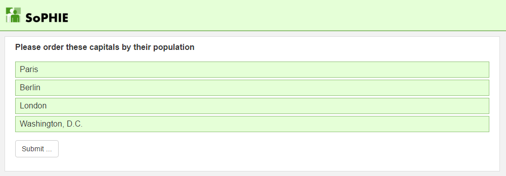
The Form Sequence Steptype can be used to get an order between certain items. The participants are able to order the items by using drag and drop on the boxes of each item.
Configuration Possibilites
All the necessary configuration can be done within the Form Tab of the Steptype. In there the Field Items can be defined. The value before the colon defines the value, that will be displayed in the output after the experiment, the value behind the colon defines the displayed information for the participant. As in other Steptypes multiple items can not be placed in the same line, they have to be defined in separate lines.
A difference to other steptypes is the Variable Format in the Processing Tab, which can be selected between Human readable, Semicolon separated and JSON array. This is to simplifiy the analysis of the output after the experiment.
View
Form Slider Number
The Form Slider Number Steptype represents an alternative to the Form Input Number Steptype. Instead of a text input field, the participant has a slider with a displayed Min. Value and Max. Value.
Configuration Possibilites
The value range can be defined in the Processing Tab as well as the Stepsize. In addition the experimenter can decide, whether the text input field is automatically selected for the participant, by selecting the Autofocus checkbox in the Form Tab. If this parameter is not selected, the participant has to select the input field actively.
As well as that the experimenter can decide, if the Slider Orientation should be horizontal or vertical, based on the needs and the Slider Fill Color, which is highlighting the selected amount, can be chosen.
The mentioned input range can either be shown or hidden by selecting the Show Slider Range checkbox. Besides that the Slider Width (CSS) can be adjusted.
View

Form Useragreement
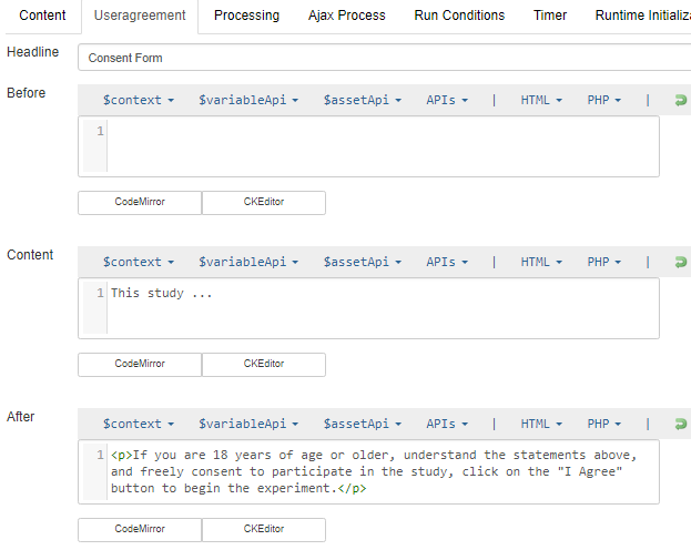
You use this form when you are asking for participants consent. The content of the consent page is defined within the Useragreement Tab
View
